I've been working on custom SWT and Workbench plugins that look more Macish than the defaults. After some discussion on the wolips list, I decided that ripping off Aperture would be a good way to go, because it comes the closest to showing samples of the layout widgets we need in Eclipse.
Here are some screenshots (and links to an early preview download at the end):
This screenshot shows the new CTabFolder/CTabItem. The design is nearly pixel-for-pixel ripped off of Aperture. Getting the view toolbars to layout properly in here took some hackery to ToolBar (because it doesn't, by default, support transparent backgrounds).

Here's the same screenshot, but with a middle tab selected.

The close icon appears when you rollover the tab image. This is nice because it keeps the layout fixed compared to Eclipse's default style, which shuffles around the left margin of tabs as you select and deselect them (to hide the close icon on unselected tabs). I think this is the way FireFox works, as well.

The Sashes on Eclipse don't draw any drag handles. Here we're showing that we now draw a drag handle (based on Aperture's style rather than the OS X standard "dot" drag handle). If the Sash is less than 3 pixels, no handle is drawn. If it's 3 or more, one is drawn, and if it's 5 or more, 2 are drawn.

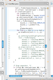
The CoolBar grabber has been changed from a rectangle to an Aperturish dotted line.

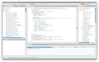
And here's the full monty screenshot (toolbar hidden) ...

There's still plenty more to do. Most of the emulated widgets are very unmacish (CCombo being an egregious example that is very high on my hit list). I'd like to get Eclipse using the unified toolbar window style as well, but just setting the flag doesn't cause it to render the unified look. I'm guessing because top toolbar isn't registered as the window's actual toolbar (and instead is just a regular view inside the window).
If you want to try this out, you can grab the binary build of the SWT and Workbench plugins from the WOLips build server and simply replace the corresponding jars in your plugins folder. Note that these ONLY work on Eclipse 3.4 and they are ALPHA QUALITY so make backups of your original plugin jars before replacing them!
16 comments:
Mike, this is very sweet .... it seems like you are having fun with this! This has the potential to become the defacto standard for Eclipse on Mac.
Mike, this looks really good. I tested the jars and it seems to work quite nicely on my machine. One thing I've seen so far is that the tabs in the launch config seem to be a bit off (too high). But really: that' great work!
Hi mike, great work!!! as you did find out, I also worked on improving the (less than adequate) look of eclipse on a mac... in my own version of the same, I took the sash width down to a single line, more in line with recent Mac apps look. I also made the CTabFolder cormers more squarish, like Safari's tabs, and changed the toolbar's color to dark grey (again like safari). you can find pictures of it in bugzilla. I was waiting for ganymede to launch to make a binary distro of the whole thing. maybe at some point we can combine forces (I made some additional enhancements to SWT to support some of the advanced painting techniques available in Swing). cheers. LM
Yeah, I wrote a Safari variant first, but the Safari tabs hang from the top, which looked really weird for anything except the top row of views. Aperture's style fit a little better (to my eye) with what Eclipse needs ... I tried the dark gray also, but the biggest problem I ran into is that Eclipse's icons are small and low contrast, and against a dark gray background, it became hard to tell what icons were grayed out (they just didn't "pop" enough). The colors I'm using are actually 20-30% lighter than Aperture's primarily because of this. Eclipse icons apparently love darker hues which look passable on white, but not-so-good on dark. That said, I am interested in the unified titlebar look, though I'm concerned about Eclipse's insane use of the toolbar. I think there needs to be better UI policy placed on the toolbar. Currently to remove items from the toolbar, you have to disable their action set, which I think also removes the corresponding menu items. There needs to be a separation of actions and toolbar extension points that provide better control over that .... The Eclipse toolbar is VERY abused right now.
I am working on a new custom perspective switcher for an RCP app. the switcher itself is basically yet another 'toolbar' like thing. I called this one a flatbar: it is basically a toolbar without any drawing code. the drawing on the flatbar is basically done using a custom Painter() implementation that is passed via setBackgroundPainter(painter). A painter can be anyting you want that implements a Painter interface. this is basically a SWT version of something added recently to Swing. One of the painters I build is able to automatically create a drop shadow for some text that is passed. another one does a 'glow' effect, another one will blur the contents... so I am in the process of creating a SWT version of the Swing ConvolutionOp. with that same scheme, it would be easy to create several Painters that would implement different tab looks. Then all that users would be able to choose which look they want.
I think a painting delegate is part of it, but ultimately I had to implement more than just painting code ... Layout and behavior change also. I think Swing actually has a pretty good model for this with their UI delegates, though, which would make a lot of sense for these Cxxxx components.
Swing's ui delegate model is great but to heavy for what I want: a quick way to reuse small pieces of code to customize the look of your widgets. basically I can get drop shadows or text effects in a single line of code. last night I finished implementing kernel based convolutions for swt images, so I can now create a gaussian blur of an image in one line of code. it is also possible to create your own graphics effects and reuse them in widgets with just one line of code. the main thing is that painters are composable, so you can use one line to add a gradient multi-linear background, another one to write some title in whichever font/color, and yet another one to have a drop shadow behind the text... I gotta re-create a blog to make it available... sigh.
dunno what your experience is, but I would lean towards saying that northover is a very.. 'strict' father.
you are right about the unified toolbar.. If you look in bugzilla, you'll see that I added code to support it. I was basically able to transfer the perspective switching to the unified toolbar. per some talks with GG and SN (plus the apple style guide) it does not make sense to transfer everything up there. my solution was to use a unified+subToolbar, like in iWorks. I managed to isolate all the code inside a custom Presentation so that you can turn this on/off. the hardest was to support the segmented hiviews.
if you know someone @ apple, I'd be interested in finding out how you can find the position of a hitoolbar item relative to the parent frame. I know that the hitoolbar instance and its view are decoupled - so that you can have multiple views of the same toolbar for separate frames - but I haven't been able to answer that question.
Gorgeous. Anything eclipse can do in this area is a must IMO.
This is very nice, very nice indeed. The editor window tabs and new max/minimize buttons are very nice. The sash is nice too, its kind of different where the editor panes are a few pixels wider than the sash. The toolbar is a big improvement. With the new dashed separators, I think I can now live without a unified toolbar.
What do you think about having the right scroll bar at the very edge of the editor pane, switching the location of the error/warning column and the scroll bar?
I just have a couple of issues, first I think the top of the editor window borders are way to thick, they look like they are at least 10 pixels high. I think they should have at the most a very thin window border.
What are the chances of getting these changes in the Cocoa swt port?
>What do you think about having the right scroll bar at the very edge of the editor pane, switching the location of the error/warning column and the scroll bar?
Mostly bad news for you :)
Re: switching the scrollbar and overview ruler: Unfortunately, the scrollbars are actually part of the editor view, so it would be a pretty large amount of work to try and put the overview ruler inside the view.
Re: the editor border -- Yeah, it is about 10 pixels (If we're talking about the same thing ... the area above the editor but below the bottom of the tab). The problem here is that I have to draw the curvature on the tab folder. What you're seeing is the radius of the curve. If you move the editor any higher, it would start to intersect with the curve, so you either have to shrink it horizontally or vertically (or both). I chose to put the extra space at the top.
Re: getting the changes into the Cocoa port ... It sounds like this is very unlikely. The Eclipse project considers the look of the tabs to be part of the branding of the Eclipse project. The best we could probably do is to extend this set of patches to encompass a pluggable look-and-feel for the C* widgets and implement all of these current patches as an optional Mac look-and-feel. Currently it's implemented in-place as a replacement.
That's awesome. I wish this ends up somewhere in easy-supportable form.
This is great and should really get into SWT, maybe using a style (like for Text with SWT.SEARCH) or anything better.
Are the sources of your changes available somewhere ? Is there a bug opened on bugzilla for this ?
The sources are all available at the github links in the upper right of this page. As far as acceptance into SWT itself, until they get better support for theming, I don't think it will happen (the curvy tabs of Eclipse are seen as part of the brand of Eclipse). Unfortunately, my changes require quite a bit of chopping in SWT, because SWT just wasn't designed with this level of customization in mind, too. I'd love to see something along the lines of UI delegates like Swing has for all of the emulated SWT components, though.
Is a version for Eclipse 3.4.2 envisaged?
Post a Comment