Monday, June 30, 2008

CCombo. My arch nemesis.

CCombo is the emulated combo box that appears in Eclipse in, for instance, combos in table cell editors. This widget constantly causes me problems throughout WOLips because it's one of the most glaringly non-native components in the SWT family. Here are some pictures to illustrate:

CCombo Closed:

CCombo Opened:
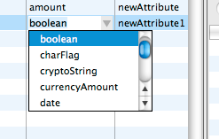
Native (Leopard) Closed:

Native (Leopard) Opened:
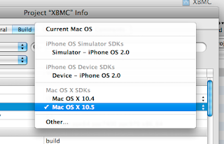
Notice that in the closed form, there's no designator that shows that it is a combo (the up/down arrow icon). Currently there's not enough API in tables to add icons like this. I haven't looked at what i would take to fix that. In the open form, it's just all-sorts-a'-wrong. It's not the Leopard window style, it doesn't have proper keyboard navigation like native. Entity Modeler fixes some of this. In fact, if you were to look at this control outside of Entity Modeler, the focus ring is offset incorrectly by several pixels as well (it hangs outside of its table cell by about 3 pixels). Unfortunately, emulating is just never going to be right here. We can get away with it for tabs, because there is no native tab widget (yet), but for combo's, there are just too many expectations. I think the correct fix for this is to make CCombo a native widget on OS X, but currently C* widgets don't have native replacements (they are in the .custom instead of the .carbon package).

Sunday, June 29, 2008

Maclipse

I've been working on custom SWT and Workbench plugins that look more Macish than the defaults. After some discussion on the wolips list, I decided that ripping off Aperture would be a good way to go, because it comes the closest to showing samples of the layout widgets we need in Eclipse.

Here are some screenshots (and links to an early preview download at the end):

This screenshot shows the new CTabFolder/CTabItem. The design is nearly pixel-for-pixel ripped off of Aperture. Getting the view toolbars to layout properly in here took some hackery to ToolBar (because it doesn't, by default, support transparent backgrounds).

Here's the same screenshot, but with a middle tab selected.

The close icon appears when you rollover the tab image. This is nice because it keeps the layout fixed compared to Eclipse's default style, which shuffles around the left margin of tabs as you select and deselect them (to hide the close icon on unselected tabs). I think this is the way FireFox works, as well.

The Sashes on Eclipse don't draw any drag handles. Here we're showing that we now draw a drag handle (based on Aperture's style rather than the OS X standard "dot" drag handle). If the Sash is less than 3 pixels, no handle is drawn. If it's 3 or more, one is drawn, and if it's 5 or more, 2 are drawn.

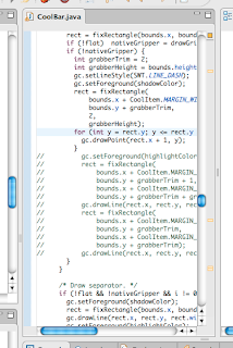
The CoolBar grabber has been changed from a rectangle to an Aperturish dotted line.

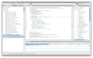
And here's the full monty screenshot (toolbar hidden) ...

There's still plenty more to do. Most of the emulated widgets are very unmacish (CCombo being an egregious example that is very high on my hit list). I'd like to get Eclipse using the unified toolbar window style as well, but just setting the flag doesn't cause it to render the unified look. I'm guessing because top toolbar isn't registered as the window's actual toolbar (and instead is just a regular view inside the window).

If you want to try this out, you can grab the binary build of the SWT and Workbench plugins from the WOLips build server and simply replace the corresponding jars in your plugins folder. Note that these ONLY work on Eclipse 3.4 and they are ALPHA QUALITY so make backups of your original plugin jars before replacing them!

Friday, June 27, 2008

WALL•E

Go see it. That is all.